Cryo is a blockchain analysis tool built by Paradigm. Cryo is the easiest way to extract blockchain data for analysis. In this article, I install Cryo, download some Ethereum data, and analyze it with polars.
Table of Contents
Open Table of Contents
Introduction to ❄️🧊 Cryo 🧊❄️
From the Cryo readme
❄️🧊 cryo 🧊❄️
cryo is the easiest way to extract blockchain data to parquet, csv, json, or a python dataframe.
cryo is also extremely flexible, with many different options to control how data is extracted + filtered + formatted
cryo is an early WIP, please report bugs + feedback to the issue tracker
Storm Silvkoff gave an amazing guide to Cryo in his Rust x Ethereum day talk:
The YouTube video is only about 20 minutes long. Would recommend.
Cryo is built on the Rust programming language. You will need to install Cargo before using Cryo.
For the second part of this article, we will explore the data we have collected with Cryo. We will use Python libraries for this, so you will need Python installed.
Installing Cryo
The first step to use Cryo is to install it.
I chose to build from source because Cryo release 0.2.0 currently has some building issues when using cargo install.
To install:
git clone https://github.com/paradigmxyz/cryo
cd cryo
cargo install --path ./crates/cli
To test your installation run:
cryo -VDownloading data
Cryo can download many different datasets:
- blocks
- transactions (alias = txs)
- logs (alias = events)
- contracts
- traces (alias = call_traces)
- state_diffs (alias for storage_diffs + balance_diff + nonce_diffs + code_diffs)
- balance_diffs
- code_diffs
- storage_diffs
- nonce_diffs
- vm_traces (alias = opcode_traces)
In this article, we’ll download and analyze the blocks dataset:
cryo blocks <OTHER OPTIONS>Data Source
Cryo needs an rpc url to extract blockchain data from. Chainlist is an RPC aggregator that collects the fastest free and open endpoints. Any of the http endpoints listed should work, but I chose https://eth.llamarpc.com/ from LlamaNodes
Our cryo command now looks like this:
cryo blocks --rpc https://eth.llamarpc.com <OTHER OPTIONS>If you get an error like the following:
send error, try using a rate limit with --requests-per-second or limiting max concurrency with --max-concurrent-requestsyou might try other rpcs.
A Note on RPCs
If you are using an online RPC, you will likely have worse performance than if you were running a local node like reth.
if you set up your own reth node you can get 10x that speed — Storm Silvkoff on Telgram
Data Directory
To keep our data separate from other files for analysis, I have created a .data directory. You must create this directory before running cryo.
Adding our data directory to the command:
cryo blocks --rpc https://eth.llamarpc.com -o ./.data/ <OTHER OPTIONS>Additional Columns
The default blocks schema includes the following columns:
schema for blocks
─────────────────
- number: uint32
- hash: binary
- timestamp: uint32
- author: binary
- gas_used: uint32
- extra_data: binary
- base_fee_per_gas: uint64
but there are also other available fields:
other available columns: logs_bloom, transactions_root, size, state_root, parent_hash, receipts_root, total_difficulty, chain_idFind this information for your dataset by running:
cryo <DATASET> --dry --rpc https://eth.llamarpc.comFor this analysis, I’m interested in the size column. We can use the -i flag in our command to tell cryo that we want size data:
cryo blocks --rpc https://eth.llamarpc.com -o ./.data/ -i size <OTHER OPTIONS>Let’s do it!
Before running, we should specify specific blocks that we are interested in so we avoid downloading the entire blocks dataset (it’s massive.) Cryo downloads data in chunks of (default) 1000 blocks, so we’ll use the --align flag to “align block chunk boundaries to regular intervals.”
Our final command looks like this:
cryo blocks -b 18100000:18190000 -i size --rpc https://eth.llamarpc.com --align -o ./.data/which downloads 90 thousand blocks from our node and stores them in the parquet format.
Running on my laptop took just 1 minute and 38 seconds!! (Still want to try running on a reth node though.)
Polars Analysis
The next step in this process is to analyze the data we have. We’ll use the polars DataFrame library to read the parquet files that we have downloaded.
I’ll use an interactive Python notebook (also known as a Jupyter Notebook) inside my VSCode development environment.
Paradigm provides an example notebook on their data website that I’ve used as a template for our analysis.
You can find the full notebook on Github, in this section I will discuss some of my findings:
Timestamps
In this section, I explore the timestamp data of blocks we downloaded:
# get all timestamps in np array
timestamps = scan_df().select(pl.col('timestamp')).collect(streaming=True).to_numpy()

# calculate time difference between blocks
time_diff = np.diff(timestamps, axis=0)
Average Block Time: 12.136534850387227
Standard Deviation of Block Time: 1.2814744196308057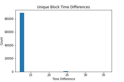
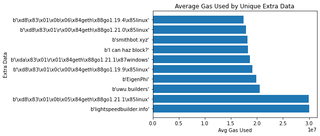
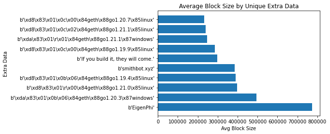
Extra data aka Block Graffiti
Extra data is
An optional free, but max. 32-byte long space to conserve smart things for ethernity. :) — https://ethereum.stackexchange.com/a/2377
Many block builders use extra data to identify that they built the block.
# get total gas used by unique extra_data
result_df = scan_df().groupby('extra_data').agg(pl.col('gas_used').sum().alias('tot_gas_used')).collect(streaming=True)
sorted_result_df = result_df.sort('tot_gas_used', descending=True).head(10)
extra_data = sorted_result_df['extra_data'].to_numpy()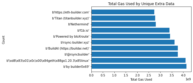
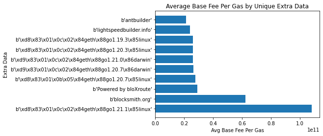
Gas
Next, I explored the base_fee of blocks over time. Gas prices, as defined in EIP-1559 include both the base_fee defined per block and a priority fee that is determined for every transaction by its sender. In this section, we analyze the base_fee to learn about gas changes over time.
# get base_fee_per_gas and timestamp, sort by timestamp
scan_df().select('base_fee_per_gas', 'timestamp').collect(streaming=True).sort('timestamp').to_numpy()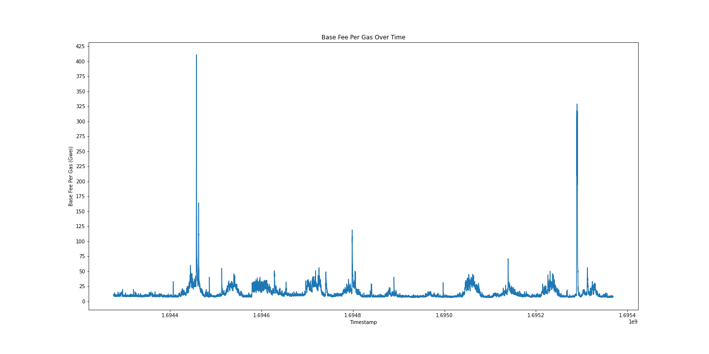
Another interesting gas-related data point we have is the gas_used in each block. Let’s use a bell curve to graph the gas_used by each block:
# get gas_used
res = scan_df().select('gas_used').collect(streaming=True).to_numpy()

# bell curve graph of gas_used
plt.figure(figsize=(20, 10))
plt.hist(res, bins=100)
plt.title('Gas Used')
plt.xlabel('Gas Used')
plt.ylabel('Count')
plt.show()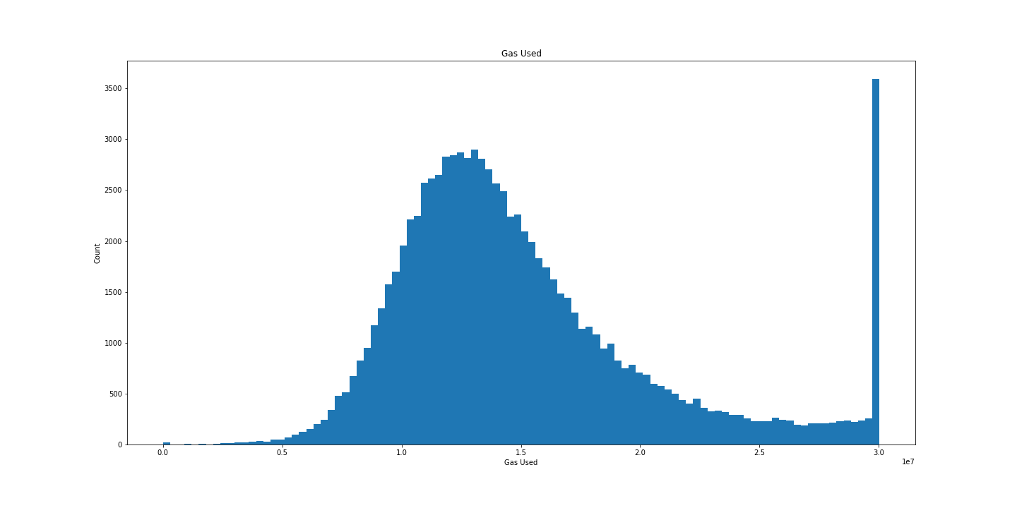
Beautiful.
Block Size
As mentioned previously, we also download the size of each block (in bytes.)
The previous distribution was pretty, let’s try that again:
# get size
res = scan_df().select('size').collect(streaming=True).to_numpy()

# bell curve graph of gas_used
plt.figure(figsize=(20, 10))
plt.hist(res, bins=150)
plt.title('Block Size')
plt.xlabel('Block Size (bytes)')
plt.ylabel('Count')
plt.show()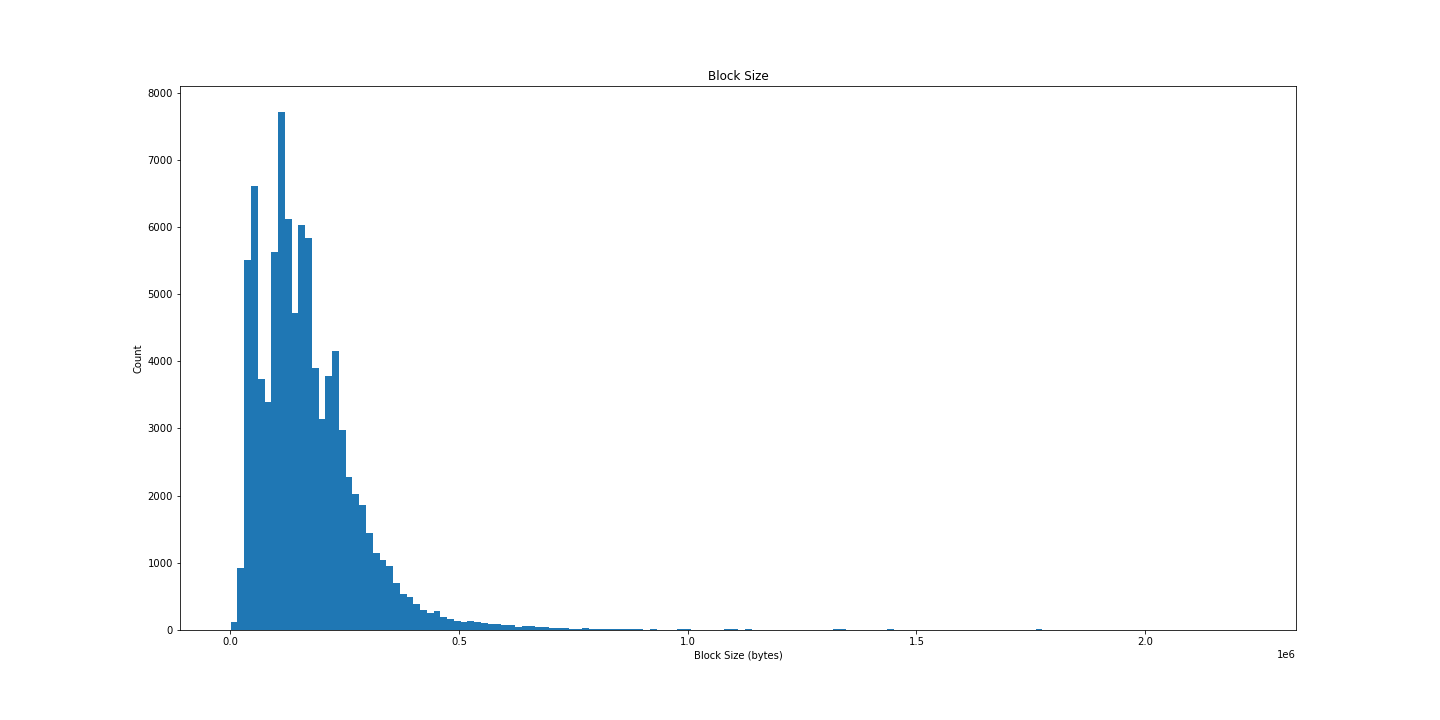
Less satisfying, but interesting all the same. Let’s try plotting over time:
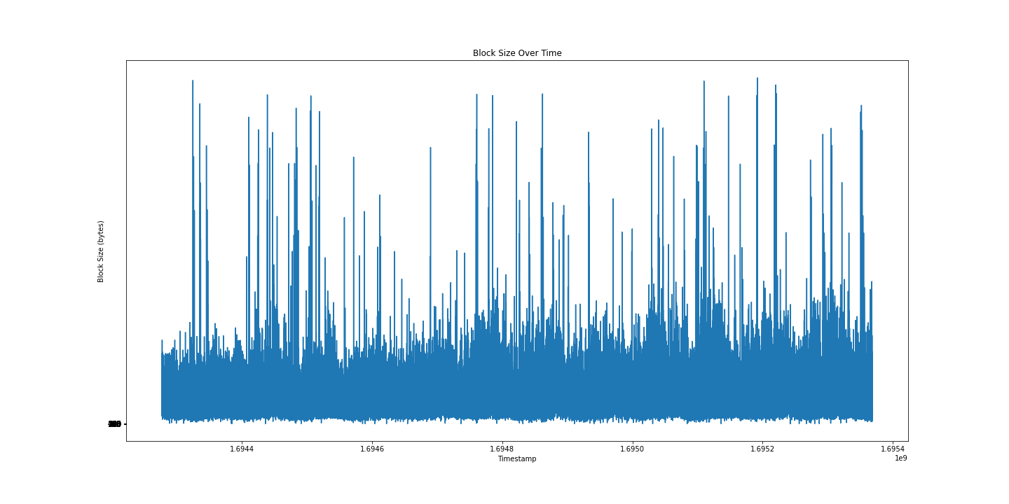
I still can’t tell much from this graph, maybe a box and whiskers will be more informative?
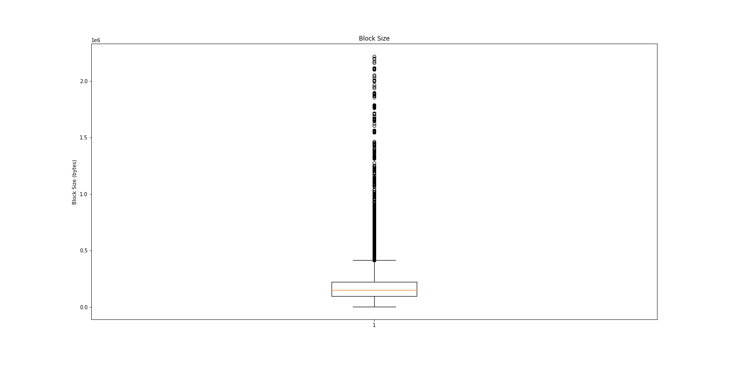
Huh. Lots of outliers. Maybe we just need numbers?
# Print some summary statistics
print("Min: ", np.min(res[:, 0]))
print("Average: ", np.mean(res[:, 0]))
print("Median: ", np.median(res[:, 0]))
print("Std Dev: ", np.std(res[:, 0]))
print("Max: ", np.max(res[:, 0]))
Min: 1115 # 1.115KB
Average: 172033.70095555554 # 0.172MB
Median: 150470.0 # 0.15MB
Std Dev: 125779.71706563157 # 0.126MB
Max: 2218857 # 2.2MBInteresting.
Conclusion
We only explored surface-level data here. I really enjoy this kind of messing around with data. Running the entire notebook takes only a few seconds.
Having such easy access to analysis of complex data increases the likelihood that people will explore their data and uncover insights.
If you found this post helpful, please consider subscribing to my newsletter for future updates: